There is a quality that the most beautiful bedrooms share, a sense that the room has depth, that it changes as the light moves through it across the day, that it rewards the time spent in it rather than simply presenting itself correctly from a distance. It is a quality that is easy to recognise and surprisingly difficult to achieve deliberately, because it is not the result of any single decision but of the relationship between many: the way a fabric catches light, the way a matte surface beside a soft sheen creates a quiet contrast, the way a warm lamp in the corner transforms the character of a room that looked merely adequate an hour earlier in full daylight. At Jane Gorman Decorators, this interplay between texture and light is something we think about in every bedroom project, because it is what separates a room that looks good in a photograph from one that genuinely feels good to inhabit.
Why texture and light cannot be considered separately
Texture and light are not independent qualities in a room. They are in constant conversation with each other, and the effect of each depends almost entirely on the presence and quality of the other. A room full of beautiful textures under flat, shadowless light loses much of what makes those textures interesting. A room with thoughtful, layered lighting but surfaces that are all smooth and uniform has warmth but lacks the visual depth that texture creates. It is the combination that produces the quality most people are reaching for when they describe a bedroom as feeling rich, warm, or considered.
This means that decisions about texture and decisions about light need to be made together rather than sequentially. The fabric for the curtains and the light source that will fall on them are one decision, not two. The material of the bedhead and the lamp that sits beside it are part of the same composition. Thinking about them separately, choosing each in isolation and hoping they resolve into something coherent, is the approach most likely to produce a room that has been well sourced but never quite arrives.
What texture actually does in a bedroom
Texture in a room does several things simultaneously, and understanding what they are helps in making decisions about where and how to use it. The most obvious function is tactile: textured surfaces invite touch and create a physical sense of warmth and material presence that smooth surfaces cannot replicate. A linen-covered bedhead, a wool throw, a jute rug: these are objects that communicate their quality through touch as much as through appearance, and that quality is felt every time they are encountered.
The less obvious but equally important function of texture is optical. Textured surfaces absorb and scatter light rather than reflecting it uniformly, which means they appear to shift in character as the light changes and as the angle of view changes. A wall covered in a textured grasscloth looks quite different in morning light than in the warm pool of a bedside lamp in the evening. A linen curtain rippling slightly in a breeze catches light along its folds in a way that a flat panel of the same fabric could not. This optical variability is what gives a room depth and what makes it feel alive rather than static.
Texture also plays an acoustic role that is rarely discussed in a design context. Soft, irregular surfaces absorb sound rather than reflecting it, which contributes to the quality of quiet that a bedroom needs. A room with significant textile presence, deep pile rugs, lined curtains, upholstered furniture, thick bedding, is acoustically softer than one with hard, smooth surfaces, and that acoustic softness contributes to the sense of the bedroom as a private, contained space rather than one that feels exposed to the sounds of the broader home.
Building a texture palette
Contrast within a family
The role of the smooth surface
Hard and soft in balance
Specific textures and how they behave
Linen
Velvet
Natural fibres and organic surfaces
Stone and ceramic
Understanding light in the bedroom
Natural light and its quality
The quality of natural light in a bedroom depends on the room’s orientation, the size and placement of its windows, and the degree to which those windows are filtered or controlled by curtains, blinds, or architectural overhangs. A north-facing bedroom in the southern hemisphere receives warm, relatively consistent light through much of the day. A south-facing room receives cooler, more diffuse light that is less flattering to warm palettes and requires more careful management through colour and material choice. An east-facing room has brilliant morning light that can be beautiful and disruptive in equal measure. A west-facing room is lit dramatically in the afternoon and evening and can feel quite dark in the morning.
Understanding the orientation of the bedroom and designing the material palette and curtain treatment in response to it, rather than applying generic choices regardless of how the room is lit, is one of the more important and more frequently overlooked aspects of bedroom design. A warm, yellow-toned palette that feels glorious in a north-facing room can feel oppressive in a south-facing one. A cool stone tile that reads as sophisticated in a warm, well-lit room feels cold and unwelcoming in one that receives little direct sun. The light is not incidental to the design. It is the condition within which the design exists, and it needs to be understood before the design is made.
How texture affects the behaviour of natural light
Artificial light and the evening bedroom
Layering artificial light sources
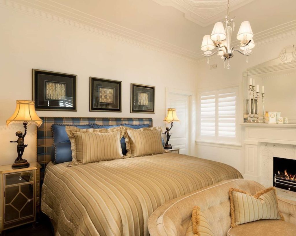
The most effective artificial lighting in a bedroom uses multiple sources at different heights and with different purposes. Overhead ambient light fills the room with a base level of illumination. Bedside lamps provide warm, directional light at the level and angle most useful for reading and for the intimate atmosphere of the bedroom in the evening. An accent source, a wall sconce, a lamp in a corner, a light inside a wardrobe or alcove, adds a point of warmth that gives the room depth and prevents the flattening effect that overhead-only lighting produces.
The interplay between these sources and the textures of the room is where the evening bedroom comes alive. A bedside lamp casting a warm pool of light across a linen bedhead reveals the fabric’s texture in the shadows it creates along each fold and weave. The same lamp reflected in a polished timber surface creates a secondary warmth that extends the light’s reach without adding another source. A wall sconce washing light upward across a textured plaster wall produces a surface animation that is entirely different in character from anything the same wall shows in daylight. These effects are the reason that light and texture need to be considered together: the most beautiful moments in a bedroom are almost always the result of the two working in combination.
Colour temperature and its effect on texture
The curtain as both texture and light filter
Curtains occupy a unique position in bedroom design because they are simultaneously one of the most significant textile elements in the room and the primary means of controlling natural light. The decisions about curtain fabric, construction, lining, heading, and fall are therefore both textural decisions and lighting decisions, and they need to be made with awareness of both dimensions.
A sheer or semi-sheer curtain in a fine linen or silk weave filters daylight into the room with a quality of warmth and softness that transforms the character of the space. The light that comes through it is diffused rather than direct, and that diffusion flatters both the room and the people in it in a way that unfiltered light rarely does. The fabric itself, billowing slightly with movement or hanging in soft folds, is one of the most beautiful textile presences a bedroom can have, and the light it creates is as much part of its contribution to the room as its physical presence.
A lined or interlined curtain in a heavier fabric serves a different purpose, controlling light more completely and adding acoustic mass to the room. The heading and the fall, whether the curtain breaks slightly on the floor or hangs with a more precise finish, contributes to the visual character of the window and by extension the room. These are not small decisions. The curtain treatment is often the largest textile element in a bedroom, and its relationship to the light the room receives is the most direct and continuous of any element in the space.
Common mistakes in texture and light
The most common mistake in bedroom texture and light is treating them as finishing touches rather than foundational decisions. Texture selected at the end of a design process, after the room has been largely specified, tends to be added rather than integrated. It reads as decoration rather than as a quality of the room itself, and the result is a bedroom that has textured surfaces without the depth and coherence that comes from texture considered alongside everything else from the outset.
Lighting as an afterthought produces a different but equally limiting result. A room where the positions of light fittings were determined by the electrician rather than the designer, where the bulb temperatures were not specified, where the dimming capability was not planned for, is a room that can only be partially enjoyed regardless of the quality of its other elements. The materials will look their best only intermittently, when the available light happens to suit them, rather than consistently, as a designed space should.
The third common mistake is buying individual pieces of texture rather than building a palette. A beautiful textured cushion on a bed that is otherwise smooth and flat, a single textured lamp beside a vanity that has no other material interest: these are good decisions that the room cannot absorb because they have nothing to relate to. Texture works through accumulation and relationship, and the most effective approach is to think about the full material palette of the room, the floor, the walls, the bed, the window, the furniture, and to consider how the textures across all of those surfaces will read in relation to each other before committing to any of them individually.
Working with Jane Gorman Decorators
The studio works with clients on bedrooms at every stage, and the conversation about texture and light is one of the earliest and most important ones the design process involves. It is also one of the most enjoyable, because it is the conversation that most directly determines whether the finished room will have the quality of depth and warmth that makes it genuinely beautiful to inhabit rather than simply correct to look at.
For clients who have bedrooms that look finished but feel flat, the problem is almost always here: in the absence of considered texture, in lighting that does not change the room’s character as the day moves through it, in surfaces that are all doing the same thing and therefore none of them doing it particularly well. These are problems with specific solutions, and finding those solutions is the kind of work the studio does most readily and most effectively.
If your bedroom has never quite produced the quality of warmth and depth you were hoping for, we would be glad to talk about why and what could change.
Frequently asked questions
How do I start building a texture palette for a bedroom?
What is the most impactful single change for adding warmth through texture?
How do I make a bedroom feel warm in the evening without it feeling dark?
Can a bedroom have too much texture?
Does the colour of artificial lighting really matter that much?
A bedroom that layers texture and light with genuine intention is one of the most satisfying rooms a home can have. It looks different in the morning than in the evening, different in summer than in winter, different on a grey day than a bright one, and all of those versions of it are worth being in. Jane Gorman Decorators works with clients to create bedrooms that have that quality: rooms with depth, warmth, and a material richness that repays the care that went into them. To discuss your bedroom or book a consultation with the studio, get in touch today.